Colors are pink and brown - so you may want to print your pics in sepia for unity. The hardest part for me (after actually making the list) is figuring out how to photo document this list.
Title: Betcha Didn't Know...
I have given this list at LEAST 10 minutes of thought, and here's what I have:
Note: This was hard - because everyone know EVERYTHING about me already, but here goes:
1. I passed the CPA exam on the first try (this would only matter to CPA's, but it only happens about 15% of the time) (NOTE: I will simply use the chipboard letters in the kit to spell CPA)
2. Vin Diesel IS my "List" (Will print out a picture of the man...)
3. Shane and I sign every note "ILYM" which stands for "I Love You More" - don't remember when it started, but probably about 10 years ago... (either use chipboard for the Acronym, or copy a card where Shane has written this)
4. I sang at Carnegie Hall ( I found a beautiful pic of Carnegie Hall on internet)
5. I have a tattoo - the White Rose of Sigma Nu (I will spare you the actual tattoo and just print a pic of a white rose)
6. I'm completely inadequate at motherhood - and this causes me extreme guilt (picture from the movie Mommie Dearest)
7. I am the poster child for "OneWeigh" - which reminds me daily NOT to ever gain weight again! (i will use the ad that runs DAILY in newspapers and magazines and the website)
So hopefully bearing my soul will help you compile your list. Group One will have this class on February 9 and Group Two will have this class on March 16.
As a hint to size of pics, etc, we will be placing our photos in a loose column format spanning 12" down the page and possibly 5" max in width - but my pic sizes will vary, so the "column" will be very disjointed.
I wish I had time today to do the layout, but my mom insists that my children are exposed to the arts (the former opera star speaks) - so we are heading to a stage performance of Beauty and the Beast today - this requires extra meds - because 4 and 5 year olds don't make it much past intermission - just an FYI...
Wish me luck! But there are really cute moments when their faces light up at the sight of the characters and staging - that's when I am thankful that my mom pushes for these "artsy" outings.
**Update**
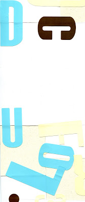
I found a way to depict each of my items. Then I planned their positions without adhering anything together. The max width of my picture area is 5 3/4" (from Carnegie Hall to the end of the One Weigh ad). The height is the full 12" of the page. Figure in about 2" for your title strip. Once I was happy with placement, I used old stickers on the back side to secure the pieces together. You could do this part at home. Then I added paper from the kit to fill in the empty spaces. You can do this part at the class (bring those extra stickers - they really help!)
Warning - I only have an 8 1/2" by 11" scanner - so this isn't my full picture area... But you can get the idea...
Here is how the back side looks - in progress. Held together by plenty of old stickers.
So, PLEASE have a general framework for your pictures - you get an A+ if they are actually "stuck" together with old stickers. This will make filling in the empty space a cinch!


1 comment:
OMG - love the idea of the old stickers! how sad that i recognize them :(
Post a Comment